You have watched a vivid story lose to a shrug. Someone brings the worst support ticket of the month to the leadership review, reads it aloud, and the room winces — then files it under unfortunate and moves on. A single story, however awful, is always survivable: it can be an exception, an edge case, someone else's fault.
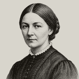
Florence Nightingale learned that lesson in the worst classroom available. She arrived at the British army hospital at Scutari in 1854 with nurses and supplies, and men kept dying anyway — in the winter of 1855 the hospital's mortality ran above forty percent of admissions, most of it from typhus, cholera and dysentery rather than wounds. Individual horror stories had been reaching London for months, and London had absorbed them. What broke the absorption was arithmetic. After the war she assembled the mortality data, compared soldiers' death rates with civilian men of the same ages, and drew the comparison as a diagram — her polar-area charts — designed so that a cabinet minister flipping pages could not miss what the count said: the army was losing more men to preventable disease in its own hospitals than to its enemies.
Her method has three parts, and every one of them transfers.
Rate, baseline, and who is missing
First, the rate, not the tally. Twelve complaints means nothing on its own; twelve per thousand orders, against three per thousand last year, is an argument. A number without a denominator is a story wearing a costume.
Second, the baseline, honestly chosen. Her comparison was soldiers against civilians of the same age — like against like. The workplace equivalent is the discipline of asking: compared with what? The team next door, the industry's record, ourselves last quarter under the same conditions. A rate that looks alarming against an unfair baseline, or comforting against a flattering one, is worse than no number, because it settles the argument wrongly.
Third — and this is the part most dashboards skip — who is left out of the count. Her hospital returns undercounted the men who died in transport before admission. Your metrics have the same gaps: churned customers who never filed a ticket, candidates who withdrew before the survey, incidents resolved quietly without a record. The absent are usually the worst cases, which means the visible rate is usually the optimistic one. Naming the gap is part of the count.
Then present it so the argument makes itself. She did not attach the tables as an appendix; she drew the comparison so the conclusion arrived with the image. The modern equivalent is one chart with the honest baseline on it, not eleven charts and a request to draw your own conclusions.
Watch out for
The count is a weapon, and weapons point both ways. A rate against a chosen baseline can manufacture outrage as easily as insight — pick the comparison after seeing the data and you are doing advocacy with statistical furniture. Nightingale herself was a ferocious advocate who chose her framings for effect; her integrity was that the underlying counts held up when hostile examiners checked them. Yours must too, which means the unflattering baseline goes in the drawer only if you can say out loud why it is wrong.
And a rate can wash out the person. The story that lost to the shrug still matters: it recruits the emotion the number then disciplines. Her genius was using both — the count to prove it general, the account to make it real.
Answer this next
For the problem you most want your organisation to take seriously: what is its rate, against what honest baseline — and who is missing from your count?